DaisyUI: CSS Components for Tailwind
DaisyUI provides ready-to-use components for Tailwind CSS while maintaining the utility-first approach
As a developer working with Tailwind CSS, you've probably experienced the power of utility-first CSS and design systems in creating beautiful and functional user interfaces. However, managing and building these components from scratch can be time-consuming and challenging. But let's be honest, sometimes writing dozens of utility classes can get repetitive and annoying. This is where DaisyUI comes in.
What is DaisyUI?
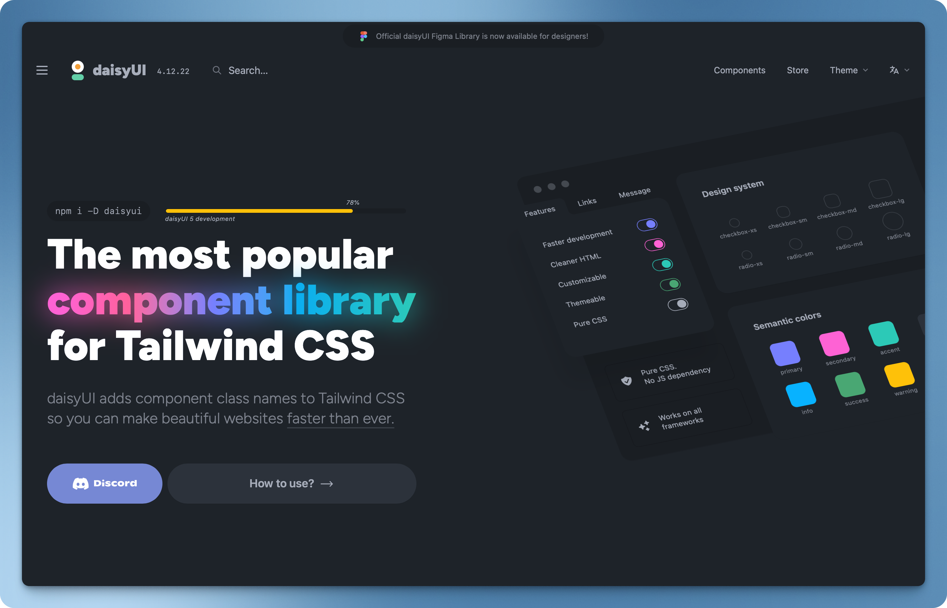
DaisyUI is a free and open-source component library for Tailwind CSS that provides ready-to-use components without leaving your HTML. Unlike other component libraries that require you to import JavaScript components, this library is purely CSS-based, making it incredibly lightweight and framework-agnostic.

What makes it unique?
Rich component library
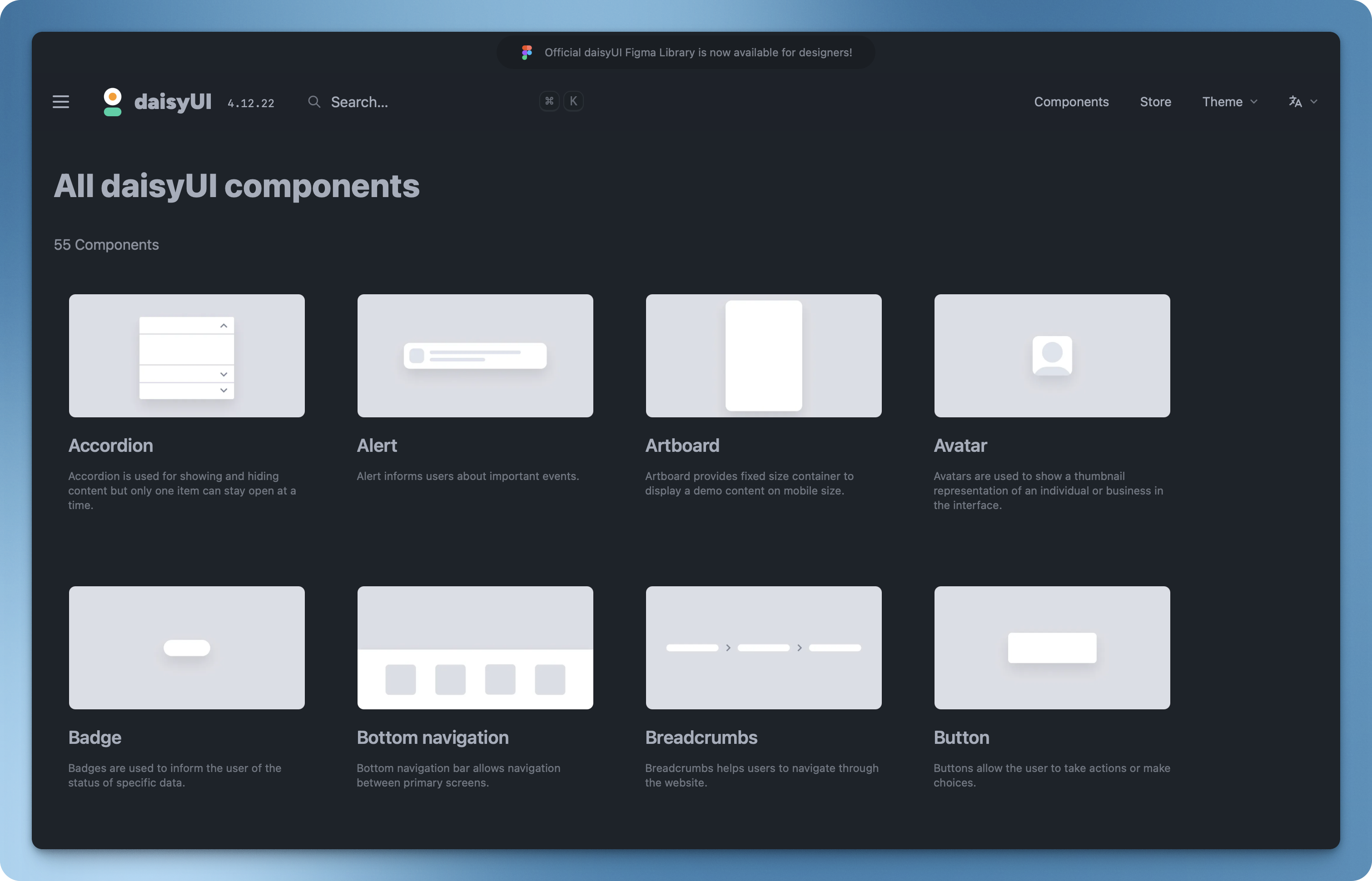
The library ships with over 40 interactive components that cover most UI needs. From simple buttons to complex carousels, you'll find components that work right out of the box. Imagine building a dashboard - instead of spending hours styling tables, modals, and navigation bars, you can have a professional-looking interface up and running in minutes.

Themeable to the Core
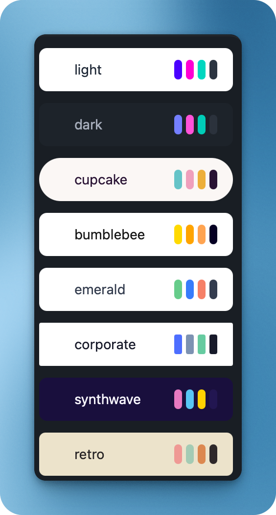
The theming system in daisyUI is amazing! With 30+ built-in color themes, you can switch the entire look of your application by changing a single attribute. This is particularly valuable for agencies building multiple client websites or developers creating white-label products. Need a dark mode? It's just one attribute away.

Framework Independence
Unlike many UI libraries that lock you into a specific framework, this solution is purely CSS-based. This means you can use it with React, Vue, Svelte, or even plain HTML. Developers can seamlessly integrate these components into legacy applications while gradually modernizing their stack - no framework migration required.
Getting started
Setting up is straightforward. Here's how you can add it to your project:
npm i -D daisyui@latestThen add it to your tailwind.config.js file:
module.exports = {
  //...
  plugins: [
    require('daisyui'),
  ],
}If you need a few example repositories to get started, you can check out the DaisyUI Examples here at the end of the page. You'll find repositories for React, Vue, Svelte, and more.
Components that make life easier
One of the best thing about daisyUI is its semantic component classes. Instead of writing:
<button class="bg-blue-500 hover:bg-blue-700 text-white font-bold py-2 px-4 rounded">
  Button
</button>You can write:
<button class="btn btn-primary">Button</button>This not only makes your code more readable but also speeds up development significantly.
Customizing components
DaisyUI components are highly customizable. You can easily change the colors, sizes, and styles of components by adding your own CSS classes. This flexibility allows you to create a consistent look and feel across your application while still leveraging the power of Tailwind CSS.
You can customize using:
- daisyUI's utility classes
- adding your own CSS classes
- tailwind's utility classes
- customizing the theme (by adding one yourself or choosing one from the daisyUI's theme list)
Read more about it here.
Theming System
DaisyUI's theming system is one of its standout features. It comes with 30+ pre-built themes, and switching between them is as simple as adding a data-theme attribute:
<div data-theme="light">
  <!-- Your content here -->
</div>You can also create custom themes by modifying your tailwind.config.js:
module.exports = {
  //...
  daisyui: {
    themes: [
      {
        mytheme: {
          "primary": "#a991f7",
          "secondary": "#f6d860",
          "accent": "#37cdbe",
          "neutral": "#3d4451",
          "base-100": "#ffffff",
        },
      },
      "dark",
      "cupcake",
    ],
  },
}We can also use CSS variables when defining themes. There is also an option to enable/disable themes for specific components / pages.
Read more about it here.
DaisyUI vs Other Component Libraries
DaisyUI is a great alternative to other component libraries like Material UI, Ant Design, or Bootstrap. It offers a more modern and customizable approach to UI development, while still being lightweight and easy to integrate.
DaisyUI vs Material UI
Material UI
- Full-featured React components
- Follows Material Design principles
- Larger bundle size
- More opinionated design
- Requires more setup and configuration
DaisyUI
- CSS-only components
- Framework agnostic
- Tiny bundle size
- More flexible styling
- Simpler setup
DaisyUI vs Ant Design
Ant Design
- Complete design system
- Rich feature set
- Heavy JavaScript dependencies
- Enterprise-focused
- Steeper learning curve
DaisyUI
- Lightweight alternative
- Focus on simplicity
- No JavaScript required
- Quick to implement
- Easier to customize
When to use DaisyUI and when not to?
When to use DaisyUI
- Rapid Prototyping: When you need to quickly build a professional-looking UI without writing extensive custom CSS
- Small to Medium Projects: Perfect for projects where you want pre-built components but don't need complex interactive features
- Framework-Agnostic Development: When you're working across different frameworks or need flexibility in your tech stack
- Design System Foundation: When you want a solid foundation to build upon, with the ability to customize as needed
- Limited Bundle Size: When performance is crucial and you want to avoid heavy JavaScript dependencies
When to consider alternatives
- Complex Enterprise Applications: If you need extensive form validation, complex data tables, or specialized components that aren't included in DaisyUI
- Strict Design Requirements: When you have very specific design guidelines that differ significantly from DaisyUI's aesthetic
- Heavy JavaScript Integration: If your project requires deeply integrated JavaScript functionality in components (consider Material UI or Ant Design instead)
- Complete Design System: When you need a full-featured design system with extensive documentation, patterns, and guidelines
- Backend Integration: If you need components that directly integrate with specific backend services or APIs
Remember that DaisyUI can be used alongside other libraries, so you're not locked into using it exclusively. You can cherry-pick components from DaisyUI while using other solutions for more complex needs.
Conclusion
DaisyUI is a powerful and flexible utility-first component library for Tailwind CSS that can significantly speed up your development process. Whether you're building a simple landing page or a complex dashboard, DaisyUI provides a solid foundation for creating beautiful and functional user interfaces.
Give it a try and see how it can transform your development workflow!