Building a Masonry Layout in React with Infinite Scroll
Learn how to build a masonry layout in React using react-responsive-masonry and improve the user experience of your web applications.
Masonry layouts are a popular way to display content in a grid-like structure. They are commonly used in web applications to showcase images, videos, and other types of content in an organized and visually appealing manner. In this tutorial, we will learn how to build a masonry layout in React using the react-responsive-masonry library.
What is a Masonry Layout?
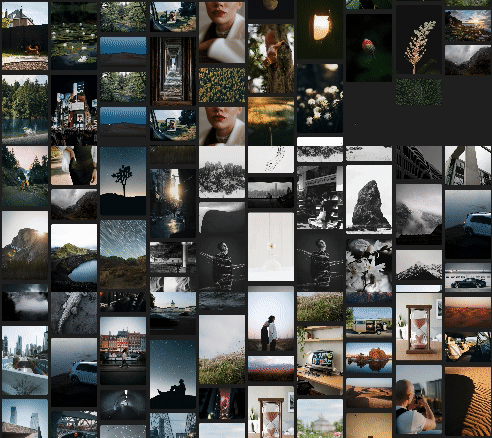
A masonry layout is a grid-based layout that arranges elements in a way that optimizes the use of space. Unlike traditional grid layouts, where each row has a fixed height, a masonry layout allows elements to be placed in columns of varying heights. This creates a more dynamic and visually interesting layout that can adapt to different screen sizes and content types.
Setting Up a React Project
Before we start building our masonry layout, let's set up a new React project using vite. If you already have a React project, you can skip this step.
pnpm create vite@latest
Follow the prompts to create a new React project. Once the project is created, navigate to the project directory and install the react-responsive-masonry library.
pnpm add react-responsive-masonry
Install the axios library to make API requests.
pnpm add axios
We will also be needing the react-infinite-scroll-component library to implement infinite scrolling.
pnpm add react-infinite-scroll-component
Also, install the dotenv library to load environment variables.
pnpm add dotenv
And we're finally ready to start building our masonry layout!
Implementing the Masonry Layout
We will be using the Unsplash API to fetch images for our masonry layout. You will need to sign up for a free account to get an access key.
Once you have your access key, create a new file called .env in the root of your project and add the following line:
VITE_UNSPLASH_ACCESS_KEY=<YOUR_ACCESS_KEY>We will be implementing the masonry layout in an infinite scroll component. So when the user scrolls down, more images will be loaded from the API. I have also written an article on Implementing Infinite Scroll in React if you want to learn more about it.
In your App.jsx file, add the following code:
import axios from "axios";
import { useEffect } from "react";
import { useState } from "react";
import InfiniteScroll from "react-infinite-scroll-component";
import Masonry, { ResponsiveMasonry } from "react-responsive-masonry";

export default function App() {
  const [images, setImages] = useState([]);
  const [page, setPage] = useState(1);

  const accessKey = import.meta.env.VITE_UNSPLASH_ACCESS_KEY;
  const fetchImages = async () => {
    try {
      const response = await axios.get(
        `https://api.unsplash.com/photos?client_id=${accessKey}&page=${page}`
      );
      console.log(response);
      setImages((prevImages) => [...prevImages, ...response.data]);
      setPage((prevPage) => prevPage + 1);
    } catch (error) {
      console.error("Error fetching images:", error);
    }
  };

  useEffect(() => {
    fetchImages();
  }, []);

  return (
    <div className="App">
      <InfiniteScroll
        dataLength={images.length}
        next={fetchImages}
        hasMore={true}
        loader={<h4>Loading...</h4>}
      >
        <ResponsiveMasonry
          columnsCountBreakPoints={{ 300: 2, 500: 3, 700: 4, 900: 5 }}
        >
          <Masonry gutter="20px">
            {images.map((image) => {
              return (
                <img
                  key={image.id}
                  src={image.urls.regular}
                  alt={image.alt_description}
                  style={{ width: "100%", borderRadius: "8px", margin: "3px" }}
                />
              );
            })}
          </Masonry>
        </ResponsiveMasonry>
      </InfiniteScroll>
    </div>
  );
}Now, let's understand the code:
-
We import the necessary libraries and set up the state variables for storing the images and the current page number.
-
We define states for the images and the current page number. The images state will store the images fetched from the API, and the page state will keep track of the current page number for pagination and infinite scrolling.
const [images, setImages] = useState([]);
const [page, setPage] = useState(1);- We fetch images from the Unsplash API using the access key stored in the environment variable.
const fetchImages = async () => {
  try {
    const response = await axios.get(
      `https://api.unsplash.com/photos?client_id=${accessKey}&page=${page}`
    );
    console.log(response);
    setImages((prevImages) => [...prevImages, ...response.data]);
    setPage((prevPage) => prevPage + 1);
  } catch (error) {
    console.error("Error fetching images:", error);
  }
};- We use the
useEffecthook to fetch images when the component mounts.
useEffect(() => {
  fetchImages();
}, []);- We render the images in a masonry layout using the
ResponsiveMasonryandMasonrycomponents from thereact-responsive-masonrylibrary.
<ResponsiveMasonry columnsCountBreakPoints={{ 300: 2, 500: 3, 700: 4, 900: 5 }}>
  <Masonry gutter="20px">
    {images.map((image) => {
      return (
        <img
          key={image.id}
          src={image.urls.regular}
          alt={image.alt_description}
          style={{ width: "100%", borderRadius: "8px", margin: "3px" }}
        />
      );
    })}
  </Masonry>
</ResponsiveMasonry>Here, gutter is the space between the images in the masonry layout, and columnsCountBreakPoints defines the number of columns based on the screen width.
- We wrap the masonry layout in an
InfiniteScrollcomponent to implement infinite scrolling.
<InfiniteScroll
    dataLength={images.length}
    next={fetchImages}
    hasMore={true}
    loader={<h4>Loading...</h4>}
>- Finally, we add some basic styling to the images to make them visually appealing.
<img
  key={image.id}
  src={image.urls.regular}
  alt={image.alt_description}
  style={{ width: "100%", borderRadius: "8px", margin: "3px" }}
/>And that's it! You have successfully implemented a masonry layout in React using the react-responsive-masonry library. You can further customize the layout by adding animations, lazy loading, and other features to enhance the user experience of your web applications.
If you've followed along, you should see something like this:

Conclusion
In this tutorial, we learned how to build a masonry layout in React using the react-responsive-masonry library. Masonry layouts are a great way to display content in a grid-like structure that adapts to different screen sizes and content types. By implementing a masonry layout in your web applications, you can improve the user experience and create visually appealing designs that engage your users.