# Shadcn: Customizable and Open Source UI
> Explore how to elevate your web projects with Shadcn's flexible, open-source components and install it in your React projects.
By Harshal Ranjhani · [HTML version](https://harshalranjhani.in/blog/shadcn-ui)
#### What is shadcn? 🤔
[Shadcn](https://ui.shadcn.com/) stands out among the many UI frameworks and libraries as a helpful resource for developers looking for an open-source, customizable way to create stunning and useful user interfaces. Shadcn is a tool to help you build your component library. These are components that you can copy and paste into your apps.
It's not a component library, which means you do not install it as a dependency from a package manager such as npm. Shadcn provides beautiful UI components which can be directly added into your app as code and you can customize it all you want.
#### How to install shadcn in a React project?
Start by creating a new React project using `vite`:
```bash
npm create vite@latest shadcn-app -- --template react-ts
```
or if you're using yarn:
```bash
yarn create vite shadcn-app --template react-ts
```
Now enter into the app by running:
```bash
cd shadcn-app
```
Install all the dependencies by running:
```bash
npm install
```
or if you're using yarn:
```bash
yarn
```
Install `tailwindcss` and it's dependencies, then generate your `tailwind.config.js` and `postcss.config.js` files:
```bash
npm install -D tailwindcss postcss autoprefixer
npx tailwindcss init -p
```
or if you're using yarn:
```bash
yarn add -D tailwindcss postcss autoprefixer
npx tailwindcss init -p
```
Edit the `tsconfig.json` file
```javascript
{
"compilerOptions": {
// ...
"baseUrl": ".",
"paths": {
"@/*": [
"./src/*"
]
}
// ...
}
}
```
Now run the following so you can import "path" without error:
```bash
npm i -D @types/node
```
Add the following to `vite.config.ts` so your app can resolve paths without error:
```javascript
import path from "path"
import react from "@vitejs/plugin-react"
import { defineConfig } from "vite"
export default defineConfig({
plugins: [react()],
resolve: {
alias: {
"@": path.resolve(__dirname, "./src"),
},
},
})
```
Now run the shadcn-ui init command to setup the project:
```bash
npx shadcn-ui@latest init
```
or if you're using yarn:
```bash
npx shadcn-ui@latest init
```
After running this you'll be prompted with a few questions, you can answer them according to your preferences or following along with me as shown:
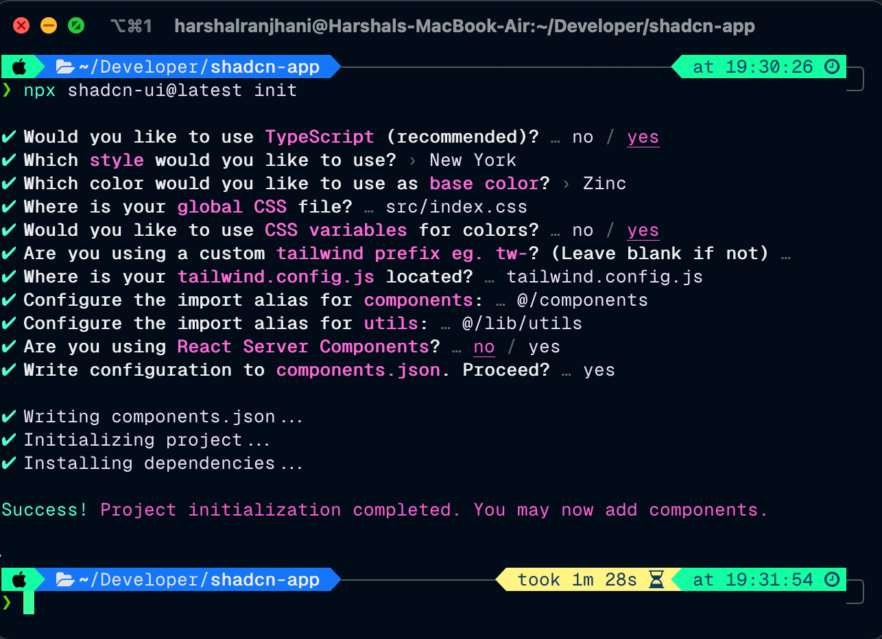
That's it! Now we're set to add `shadcn` components to our app in a breeze! 🎉
There is a massive list of components we can add that shadcn provides us, you can find the list [here](https://ui.shadcn.com/docs/components/accordion). Starting from Accordion all the way to tooltips we have almost all components used in projects with a great design.
In this article, I am going to show you how to add a button as well as an alert dialog component using `shadcn`. You can try adding other components as well!
To add a button component let's run:
```bash
npx shadcn-ui@latest add button
```
or if you're using yarn:
```bash
npx shadcn-ui@latest add button
```
To add the alert dialog component run:
```bash
npx shadcn-ui@latest add alert-dialog
```
of if you're using yarn:
```bash
npx shadcn-ui@latest add alert-dialog
```
Change the `App.tsx` to this:
```typescript
import { useState } from "react";
import "./App.css";
import { Button } from "@/components/ui/button";
import {
AlertDialog,
AlertDialogAction,
AlertDialogCancel,
AlertDialogContent,
AlertDialogDescription,
AlertDialogFooter,
AlertDialogHeader,
AlertDialogTitle,
AlertDialogTrigger,
} from "@/components/ui/alert-dialog";
function App() {
const [count, setCount] = useState(0);
return (
<>
Vite + React
Something here?
This action cannot be undone. This action is harmful.
CancelContinue
);
}
export default App;
```
You should see something like this:
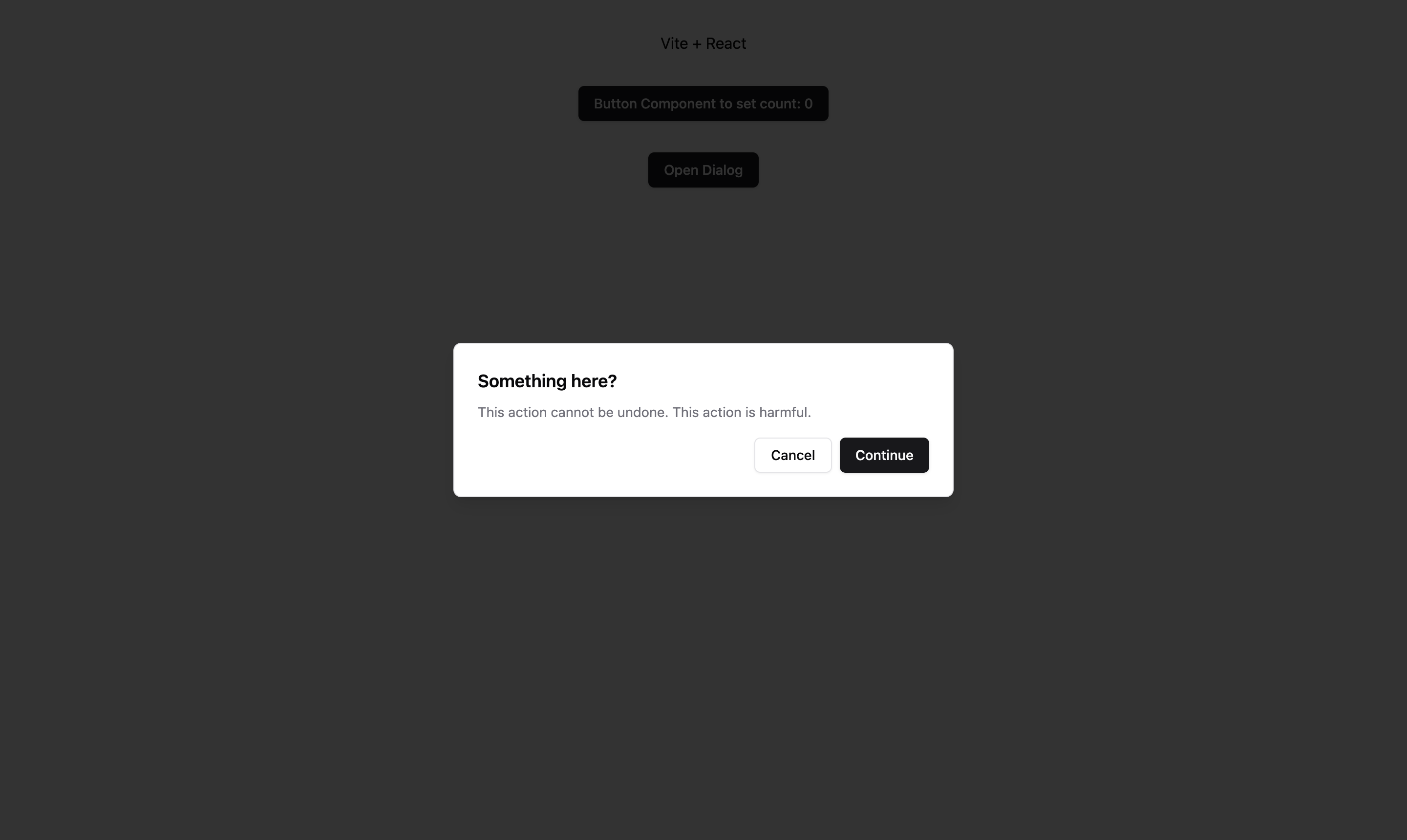
Here we're using a shadcn button to control the alert, as well as using the button to increase the `count` state.
#### Support with other frameworks:
Other than React, shadcn is also supported on multiple other frameworks including Next.js and Astro among many others. You can find more [here](https://ui.shadcn.com/docs/installation).
[Shadcn](https://ui.shadcn.com/) also has various themes, and color customizations to better meet your design needs. It's a really intuitive and developer friendly tool which you should start using today if you're already not!
Last updated on March 20, 2024