Recharts: The Ultimate React Charting Library
Discover how Recharts, a flexible and powerful charting library built on React components, can elevate your data visualization game.
In today's data-driven world, the ability to visualize data effectively is more important than ever. Whether you're a data scientist, a developer, or a business analyst, creating insightful and interactive charts can help you communicate complex information clearly. One of the best tools available for this purpose is Recharts — a composable charting library built entirely on React components. In this blog post, we'll delve into what makes Recharts unique and how you can use it to enhance your data visualization capabilities.
What is Recharts?
This charting library is an open-source, declarative solution designed specifically for React applications. Unlike many other charting libraries that can be cumbersome to configure and integrate, this library is engineered to be highly customizable and easy to use. By leveraging the power of React, it allows developers to create complex and interactive charts with minimal effort.
One of the key features that sets this library apart from others is its composable nature. It provides a wide range of chart components that can be combined to create sophisticated visualizations. Whether you need a simple line chart or a complex radar chart, this library has you covered.
Why Use this library?
Declarative Syntax:
Recharts uses a declarative syntax that makes it easy to define the structure of your charts. By specifying the data and configuration options in a clear and concise manner, you can create complex charts with minimal code.
<ResponsiveContainer width="100%" height={400}>
  <LineChart data={data}>
    <Line type="monotone" dataKey="value" stroke="#8884d8" />
    <CartesianGrid stroke="#ccc" />
    <XAxis dataKey="name" />
    <YAxis />
  </LineChart>
</ResponsiveContainer>Composable Components:
Recharts components are designed to be composable. This means you can combine multiple components like <BarChart>, <LineChart>, and <PieChart> within the same visualization. This modularity allows you to tailor your charts to meet your specific requirements easily.
Responsive Design:
The library provides a <ResponsiveContainer> component that automatically adjusts the size of your charts based on the dimensions of the parent container. This makes it easy to create charts that look great on any device or screen size.
Interactive Features:
It also supports a wide range of interactive features, including tooltips, legends, and zooming. These features make it easy for users to explore and interact with your charts, enhancing the overall user experience.
Customization Options:
Recharts offers a wide range of customization options, allowing you to style your charts to match your brand or application's design. You can customize everything from colors and fonts to axis labels and grid lines.
Getting Started with Recharts
To get started with Recharts, you'll need to install the library using npm or yarn:
pnpm add recharts
or if you're using yarn:
yarn add rechartsOnce you've installed Recharts, you can import the components you need and start creating your charts. Here's a simple example of how to create a line chart using Recharts:
Basic Line Chart Example
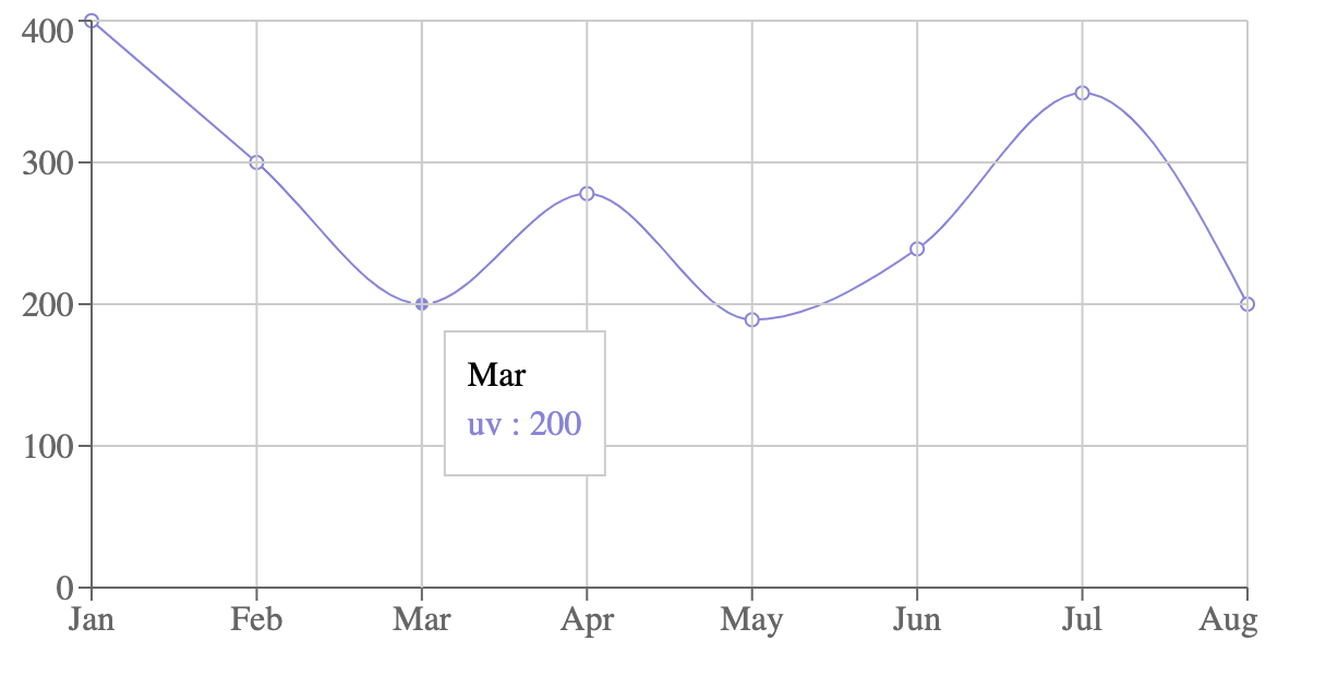
In this example, we're creating a simple line chart that displays the UV index for each month of the year. We're using the <LineChart>, <Line>, <CartesianGrid>, <XAxis>, <YAxis>, and <Tooltip> components provided by Recharts to define the structure of the chart.
import React from "react";
import {
  LineChart,
  Line,
  CartesianGrid,
  XAxis,
  YAxis,
  Tooltip,
} from "recharts";

const data = [
  { name: "Jan", uv: 400 },
  { name: "Feb", uv: 300 },
  { name: "Mar", uv: 200 },
  { name: "Apr", uv: 278 },
  { name: "May", uv: 189 },
  { name: "Jun", uv: 239 },
  { name: "Jul", uv: 349 },
  { name: "Aug", uv: 200 },
];

const SimpleLineChart = () => (
  <LineChart width={600} height={300} data={data}>
    <Line type="monotone" dataKey="uv" stroke="#8884d8" />
    <CartesianGrid stroke="#ccc" />
    <XAxis dataKey="name" />
    <YAxis />
    <Tooltip />
  </LineChart>
);

export default SimpleLineChart;Let's go through the components used in this example:
-
<LineChart>: The main container for the line chart. It accepts thewidthandheightprops to define the dimensions of the chart. -
<Line>: Represents the line in the line chart. It accepts thedataKeyprop to specify the key in the data array that contains the values to be plotted. -
<CartesianGrid>: Renders the grid lines in the chart. -
<XAxis>: Renders the x-axis of the chart. It accepts thedataKeyprop to specify the key in the data array that contains the x-axis values. -
<YAxis>: Renders the y-axis of the chart. -
<Tooltip>: Displays a tooltip when the user hovers over the chart.
If you've been following along, this is how it should look with the tooltip:
By combining these components, you can create a wide range of charts that suit your specific needs.
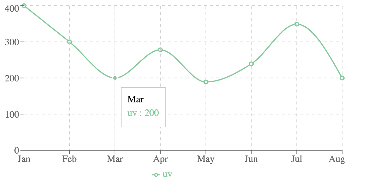
Customizing Your Charts
Recharts offers a wide range of customization options that allow you to style your charts to match your application's design. You can customize the colors, fonts, labels, and other visual elements of your charts to create a cohesive and visually appealing user experience.
const CustomLineChart = () => (
  <LineChart width={600} height={300} data={data}>
    <Line type="monotone" dataKey="uv" stroke="#82ca9d" strokeWidth={2} />
    <CartesianGrid stroke="#ccc" strokeDasharray="5 5" />
    <XAxis dataKey="name" />
    <YAxis />
    <Tooltip />
    <Legend />
  </LineChart>
);Customized chart should look like this:
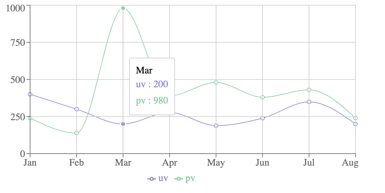
Adding Multiple Lines to Your Chart
Recharts makes it easy to add multiple lines to your chart by simply adding additional <Line> components. Each <Line> component can represent a different data series, allowing you to compare multiple datasets within the same visualization.
const data = [
  { name: "Jan", uv: 400, pv: 240 },
  { name: "Feb", uv: 300, pv: 139 },
  { name: "Mar", uv: 200, pv: 980 },
  { name: "Apr", uv: 278, pv: 390 },
  { name: "May", uv: 189, pv: 480 },
  { name: "Jun", uv: 239, pv: 380 },
  { name: "Jul", uv: 349, pv: 430 },
  { name: "Aug", uv: 200, pv: 240 },
];

const MultiLineChart = () => (
  <LineChart width={600} height={300} data={data}>
    <Line type="monotone" dataKey="uv" stroke="#8884d8" />
    <Line type="monotone" dataKey="pv" stroke="#82ca9d" />
    <CartesianGrid stroke="#ccc" />
    <XAxis dataKey="name" />
    <YAxis />
    <Tooltip />
    <Legend />
  </LineChart>
);Here is the output of the multi-line chart:
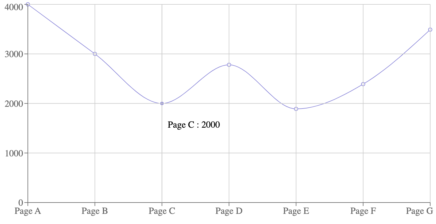
Custom Axes and Labels
In some scenarios, you might need to customize the axes to better suit your data. Recharts allows for extensive customization in this area.
import React from "react";
import {
  LineChart,
  Line,
  XAxis,
  YAxis,
  CartesianGrid,
  Tooltip,
  Legend,
  ResponsiveContainer,
} from "recharts";

const data = [
  {
    name: "Page A",
    uv: 4000,
    pv: 2400,
    amt: 2400,
  },
  {
    name: "Page B",
    uv: 3000,
    pv: 1398,
    amt: 2210,
  },
  {
    name: "Page C",
    uv: 2000,
    pv: 9800,
    amt: 2290,
  },
  {
    name: "Page D",
    uv: 2780,
    pv: 3908,
    amt: 2000,
  },
  {
    name: "Page E",
    uv: 1890,
    pv: 4800,
    amt: 2181,
  },
  {
    name: "Page F",
    uv: 2390,
    pv: 3800,
    amt: 2500,
  },
  {
    name: "Page G",
    uv: 3490,
    pv: 4300,
    amt: 2100,
  },
];

const CustomizedLabel = ({ x, y, stroke, value }) => {
  return (
    <text x={x} y={y} dy={-4} fill={stroke} fontSize={10} textAnchor="middle">
      {value}
    </text>
  );
};

const CustomizedAxisTick = ({ x, y, payload }) => {
  return (
    <g transform={`translate(${x},${y})`}>
      <text
        x={0}
        y={0}
        dy={16}
        textAnchor="end"
        fill="#666"
        transform="rotate(-35)"
      >
        {payload.value}
      </text>
    </g>
  );
};

const Example = () => {
  return (
    <ResponsiveContainer width="100%" height={400}>
      <LineChart
        data={data}
        margin={{
          top: 20,
          right: 30,
          left: 20,
          bottom: 10,
        }}
      >
        <CartesianGrid strokeDasharray="3 3" />
        <XAxis dataKey="name" height={60} tick={<CustomizedAxisTick />} />
        <YAxis />
        <Tooltip />
        <Legend />
        <Line
          type="monotone"
          dataKey="pv"
          stroke="#8884d8"
          label={<CustomizedLabel />}
        />
        <Line type="monotone" dataKey="uv" stroke="#82ca9d" />
      </LineChart>
    </ResponsiveContainer>
  );
};
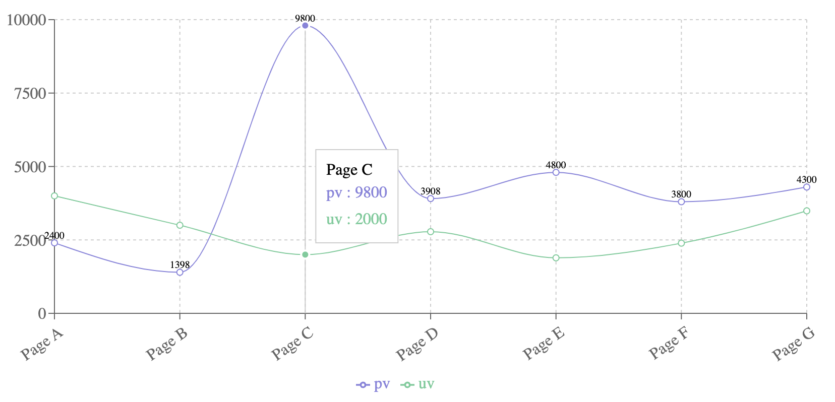
export default Example;Let's break down the customizations made in this example:
Custom Labels on Line Data Points
- A custom label (
CustomizedLabel) is created to display data points on the line chart. - The
CustomizedLabelcomponent is a functional component that returns atextelement positioned at the coordinates (x,y) of each data point with an offset (dy) of-4. - The
fillattribute is set to the stroke color passed from the parent, and thetextAnchoris set to"middle"for alignment.
const CustomizedLabel = ({ x, y, stroke, value }) => {
  return (
    <text x={x} y={y} dy={-4} fill={stroke} fontSize={10} textAnchor="middle">
      {value}
    </text>
  );
};Custom Axis Tick
- A custom tick (
CustomizedAxisTick) is created for the X-axis labels. - The
CustomizedAxisTickcomponent is a functional component that returns agelement (group) containing atextelement. - The label is rotated
-35degrees for better visibility and alignment with the axis.
const CustomizedAxisTick = ({ x, y, payload }) => {
  return (
    <g transform={`translate(${x},${y})`}>
      <text
        x={0}
        y={0}
        dy={16}
        textAnchor="end"
        fill="#666"
        transform="rotate(-35)"
      >
        {payload.value}
      </text>
    </g>
  );
};LineChart Setup
- The
LineChartcomponent is used to create the chart, withResponsiveContainerensuring it is responsive. - The
dataprop is assigned the static array containing the data points.
const Example = () => {
  return (
    <ResponsiveContainer width="100%" height="100%">
      <LineChart
        width={500}
        height={300}
        data={data}
        margin={{
          top: 20,
          right: 30,
          left: 20,
          bottom: 10,
        }}
      >
        <CartesianGrid strokeDasharray="3 3" />
        <XAxis dataKey="name" height={60} tick={<CustomizedAxisTick />} />
        <YAxis />
        <Tooltip />
        <Legend />
        <Line
          type="monotone"
          dataKey="pv"
          stroke="#8884d8"
          label={<CustomizedLabel />}
        />
        <Line type="monotone" dataKey="uv" stroke="#82ca9d" />
      </LineChart>
    </ResponsiveContainer>
  );
};CartesianGridadds a grid for better readability.XAxisutilizes CustomizedAxisTick for custom tick formatting.YAxisis a simple vertical axis.TooltipandLegendare included to provide interactive elements and legend info.Lineis used to draw the lines with different stroke colors, andlabelis used to add the custom labels created.
Finally, it should look like this:
Custom Tooltips
Similar to custom labels, you can also create custom tooltips to display additional information when users interact with your charts. Custom tooltips can be used to provide more context or details about the data points being displayed.
const CustomTooltip = ({ active, payload, label }) => {
  if (active && payload && payload.length) {
    return (
      <div className="custom-tooltip">
        <p className="label">{`${label} : ${payload[0].value}`}</p>
      </div>
    );
  }

  return null;
};

const CustomTooltipChart = () => (
  <LineChart width={600} height={300} data={data}>
    <Line type="monotone" dataKey="uv" stroke="#8884d8" />
    <CartesianGrid stroke="#ccc" />
    <XAxis dataKey="name" />
    <YAxis />
    <Tooltip content={<CustomTooltip />} />
    <Legend />
  </LineChart>
);The customized tooltip should look like this:
Comparison with Other Charting Libraries
While Recharts is a powerful and flexible charting library, it's not the only option available. Let's take a quick look at how Recharts compares to two other popular charting libraries: Chart.js and Victory.
Chart.js is a widely used charting library that supports a variety of chart types and offers a simple, declarative API. Here's an example of how you might create a line chart using Chart.js:
import { Line } from "react-chartjs-2";

const data = {
  labels: ["Jan", "Feb", "Mar", "Apr", "May", "Jun"],
  datasets: [
    {
      label: "Sales",
      data: [12, 19, 3, 5, 2, 3],
      fill: false,
      borderColor: "rgb(75, 192, 192)",
      tension: 0.1,
    },
  ],
};

const LineChart = () => <Line data={data} />;

export default LineChart;This is how the line chart should look using Chart.js:
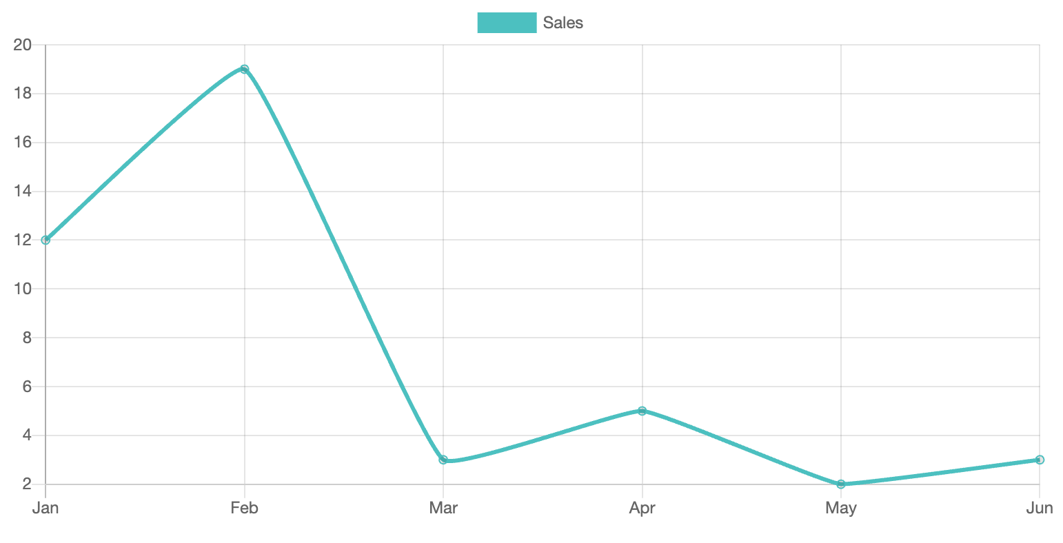
While Chart.js is easy to use and has good documentation, it may not be as flexible or customizable as Recharts. Additionally, Chart.js is not built specifically for React, so it may require more setup and configuration to integrate with your React application.
Victory is another popular charting library that is built specifically for React. It offers a composable API similar to Recharts and supports a wide range of chart types and customization options. Here's an example of how you might create a line chart using Victory:
import { VictoryLine, VictoryChart, VictoryAxis } from "victory";

const data = [
  { x: 1, y: 2 },
  { x: 2, y: 3 },
  { x: 3, y: 5 },
  { x: 4, y: 4 },
  { x: 5, y: 7 },
];

const LineChart = () => (
  <VictoryChart>
    <VictoryLine data={data} />
    <VictoryAxis />
    <VictoryAxis dependentAxis />
  </VictoryChart>
);

export default LineChart;This is how the line chart should look using Victory:
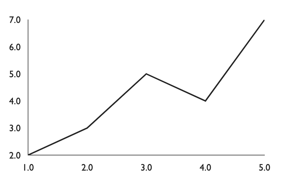
Victory offers many of the same benefits as Recharts, including a composable API and extensive customization options. However, Victory may have a steeper learning curve than Recharts, and its documentation may not be as comprehensive.
Conclusion
Recharts is a powerful and flexible charting library that can help you create stunning data visualizations in your React applications. By leveraging the composable nature of Recharts components, you can easily build complex and interactive charts with minimal effort. Whether you need a simple line chart or a more advanced radar chart, Recharts has the tools you need to bring your data to life.
You can explore the full range of Recharts components and customization options by visiting the official Recharts documentation.