Best React UI Library: 5 Popular Choices
Discover the best React UI library with this comparison of five popular options, detailing features, pros, and cons.
React is a popular JavaScript library for building user interfaces. It is maintained by Facebook and a community of individual developers and companies. React is used to build single-page applications and user interfaces for web and mobile applications. React is a component-based library, which means that you can create reusable components that can be used to build complex user interfaces. Many developers also use React in conjunction with what they consider the best React UI library to further enhance their development process and create more polished, feature-rich applications.
However, building a polished user interface from scratch can be time-consuming and challenging. That's where UI libraries come in. UI libraries provide pre-built components that you can use to build your user interface quickly and easily. There are many UI libraries available for React, each with its own strengths and weaknesses. In this article, we will compare some of the best UI libraries for React to help you choose the one that is right for your project.
Benefits and Challenges of Using a UI Library
Benefits:
-
Faster Development: UI libraries provide pre-built components that you can use to build your user interface quickly and easily. This can save you a lot of time and effort compared to building your user interface from scratch.
-
Consistent Design: UI libraries provide a set of pre-designed components that you can use to ensure a consistent design across your application. This can help you create a polished and professional-looking user interface.
-
Responsive Design: Many UI libraries provide responsive components that automatically adjust to different screen sizes. This can help you create a user interface that looks good on a wide range of devices.
Challenges:
-
Inconsistent Design: While UI libraries can help you create a consistent design, they can also make your application look generic if you don't customize the components to fit your brand and design requirements.
-
Predetermined Choices: UI libraries provide pre-built components that you can use to build your user interface. However, these components may not always fit your specific needs, and customizing them can be challenging.
When to Use a UI Library?
You should consider adopting a React UI library based on your project requirements and your team's expertise. Here are some scenarios where leveraging a React UI library can be particularly beneficial:"
-
Rapid Prototyping: If you need to quickly build a prototype or proof of concept, a UI library can help you get up and running fast.
-
No Design Team: If you don't have a dedicated design team, a UI library can help you create a polished user interface without the need for extensive design work.
-
Align with Design System: If your project needs to align with a design system or brand guidelines, a UI library can help you create a consistent design across your application.
The Contenders: 5 Popular Choices for the Best React UI Library
Material-UI
Overview
Material-UI, now known as MUI, is a popular react UI library for React based on Google’s Material Design principles. It offers a comprehensive suite of customizable components that developers can easily integrate into their projects.
Key Features
-
Icons: Material-UI provides a wide range of icons that you can use in your application. You can easily customize the size, color, and style of the icons.
-
Themes: Material-UI allows you to create custom themes for your application. You can define the colors, typography, and other design elements of your theme.
-
Typography: Material-UI provides a set of typography components that you can use to style your text. You can customize the font size, weight, and style of the text.
-
Data display: Material-UI provides components for displaying data, such as tables, lists, and cards. You can easily customize the appearance of these components to fit your design requirements.
-
Dark mode: Material-UI supports dark mode out of the box. You can easily switch between light and dark mode by changing the theme settings.
Benefits
-
Pre-built Components: Includes buttons, grids, icons, sliders, and many other components that you can easily plug into your app.
-
Theming: Provides robust theming capabilities, allowing developers to create a consistent look and feel throughout their app.
-
Accessibility: Built with accessibility in mind, making sure your components are usable for all users.
-
Customizability: The library includes an extensive set of intuitive customizability features. The templates in their store demonstrate how far you can go with customization.
Some stats
- GitHub Stars: 93.2k
- Weekly Downloads: ~4M
- Open Source Contributors: ~3k
Installation
You can install Material-UI using npm:
pnpm add @mui/material @emotion/react @emotion/styled
With styled-components:
Material UI uses Emotion as its default styling engine. If you want to use styled-components instead, run one of the following commands:
pnpm add @mui/material @mui/styled-engine-sc styled-components
You can follow the styled-components-guide to learn more about using styled-components with Material-UI.
A note from the MUI team:
As of late 2021, styled-components is not compatible with server-rendered Material UI projects. This is because babel-plugin-styled-components isn't able to work with the styled() utility inside @mui packages. See this GitHub issue for more details.
We strongly recommend using Emotion for SSR projects.
Example Usage
Here's an example of how you can use a button component from Material-UI in your React application:
import * as React from "react";
import Button from "@mui/material/Button";

export default function ButtonUsage() {
  return <Button variant="contained">Hello world!</Button>;
}Ant Design
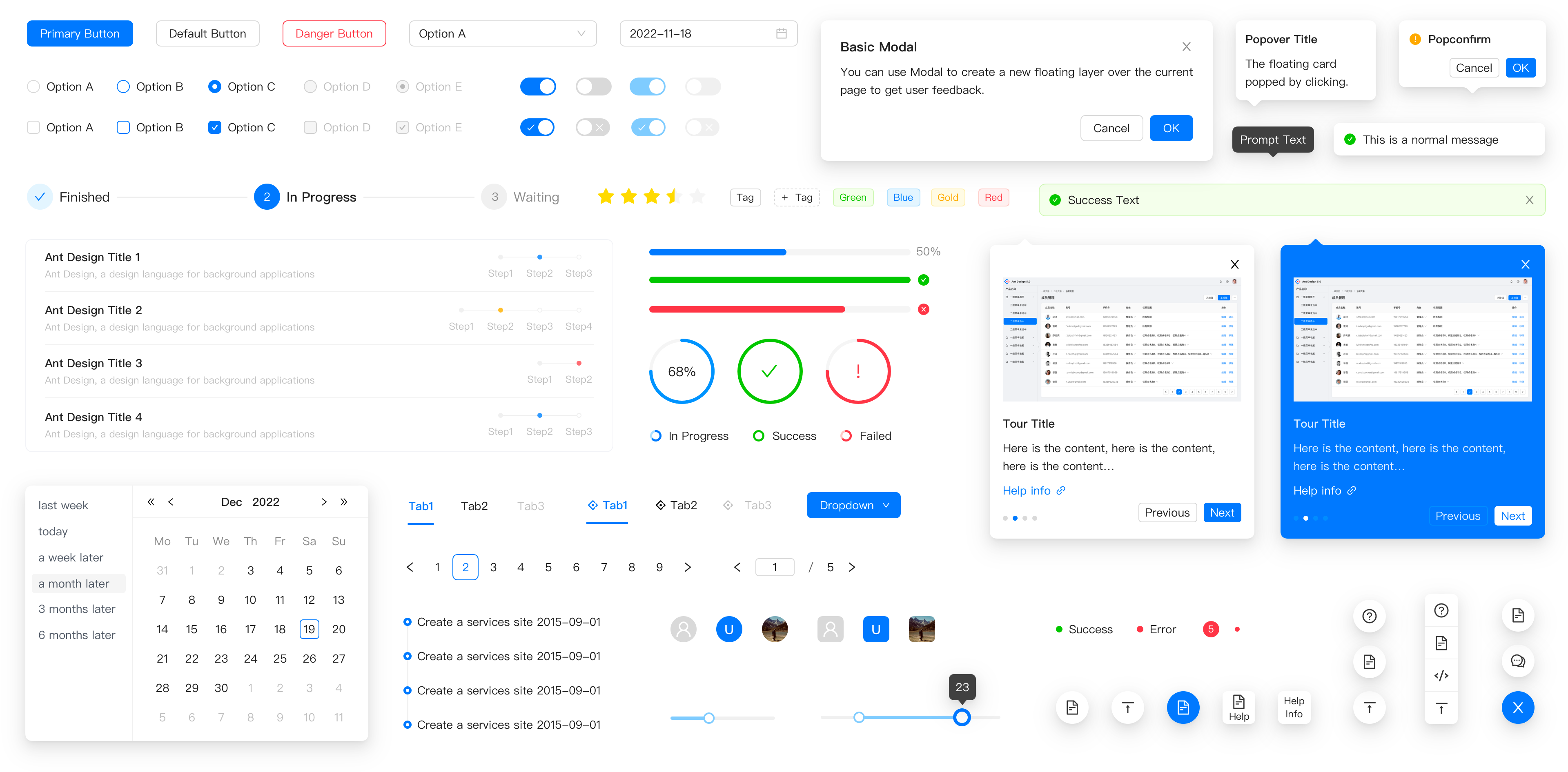
Overview
Ant Design is a design system for enterprise-level products. It provides a set of high-quality React components that you can use to build your applications. Ant Design is known for its clean design and extensive documentation.
Key Features
-
Internationalization: This React UI library supports multiple languages out of the box, making it easy to create applications for a global audience.
-
Theme Customization: Ant Design allows you to customize the theme of your application using its built-in theme customization tools. You can change the colors, typography, and other design elements of your application. Dark mode is also supported.
-
Icons: Ant Design provides a set of icons that you can use in your application. You can easily customize the size, color, and style of the icons.
-
Data Visualization: Ant Design provides components for data visualization, such as charts and graphs. You can easily create interactive data visualizations for your application.
Benefits
-
Support for Multiple Platforms and Frameworks: Ant Design supports multiple platforms and frameworks, including React, Vue, Angular, Next.js, and more. This makes it easy to use Ant Design in different projects.
-
Focus on Enterprise: Ant Design is designed for enterprise-level products, making it a good choice for applications that require a professional and polished design.
-
Extensive Documentation: Ant Design has extensive documentation that covers all aspects of the library. This makes it easy to get started with Ant Design and learn how to use its components.
-
Community Support: Ant Design has a large and active community of developers who contribute to the library and provide support to other developers.
Some stats
- GitHub Stars: 91.8k
- Weekly Downloads: ~1.5M
- Open Source Contributors: ~2.1k
Installation
You can install Ant Design using npm:
pnpm add antd
Example Usage
Here's an example of how you can use a button and a date picker component from Ant Design in your React application:
import { Button, DatePicker } from "antd";

export default () => (
  <>
    <Button type="primary">PRESS ME</Button>
    <DatePicker placeholder="select date" />
  </>
);Chakra UI
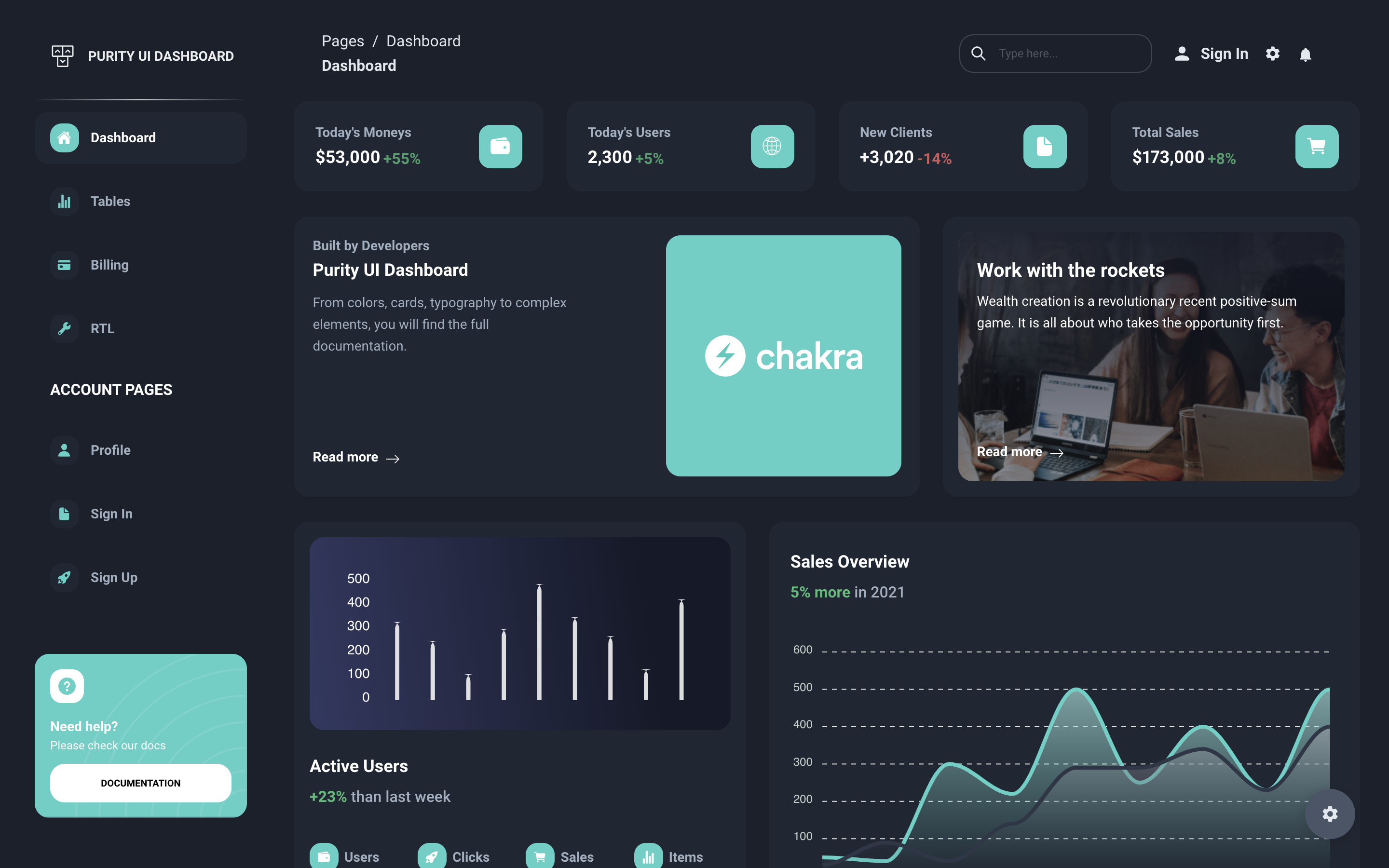
Overview
Chakra UI is a simple, modular, and accessible component library that gives you the building blocks you need to build your React applications. It is designed to be easy to use and customize, making it a popular choice among developers.
Key Features
-
Responsive Layouts: Chakra UI includes layout components that simplify creating responsive designs. With components like Flex, Grid, and Stack, you can build layouts that adapt to different screen sizes and devices effortlessly.
-
Accessibility: Chakra UI prioritizes accessibility, ensuring that its components meet WAI-ARIA guidelines. This focus helps make your application more inclusive and usable for individuals with disabilities.
-
Figma UI Kit: Chakra UI provides a Figma UI kit that you can use to design your application. This makes it easy to create a consistent design across your application.
-
Dark mode: Chakra UI supports dark mode out of the box. You can easily switch between light and dark mode by changing the theme settings.
Benefits
-
Component Library: This React UI library provides a wide range of components that you can use to build your user interface. These components are designed to be easy to use and customize.
-
Support for multiple platforms: Chakra UI supports multiple platforms, including React, Vue, and Next.js. This makes it easy to use Chakra UI in different projects.
-
Accessibility: Chakra UI is designed to be accessible, making sure that your components are usable for all users.
-
Integrations: Chakra UI integrates with popular tools like Framer Motion and React Hook Form, making it easy to add animations and forms to your application.
Some stats
- GitHub Stars: 37.4k
- Weekly Downloads: ~550k
- Open Source Contributors: ~600
Installation
You can install Chakra UI using npm:
npm i @chakra-ui/react @emotion/react @emotion/styled framer-motionAfter installing the required packages, you can wrap your application with the ChakraProvider component to enable Chakra UI components:
import * as React from "react";

// 1. import `ChakraProvider` component
import { ChakraProvider } from "@chakra-ui/react";

function App() {
  // 2. Wrap ChakraProvider at the root of your app
  return (
    <ChakraProvider>
      <TheRestOfYourApplication />
    </ChakraProvider>
  );
}Example Usage
Here's an example of how you can use a button component from Chakra UI in your React application:
import * as React from "react";
import { Button, ButtonGroup } from "@chakra-ui/react";

export const Example = () => (
  <ButtonGroup>
    <Button colorScheme="blue">Save</Button>
    <Button colorScheme="red">Delete</Button>
  </ButtonGroup>
);Mantine
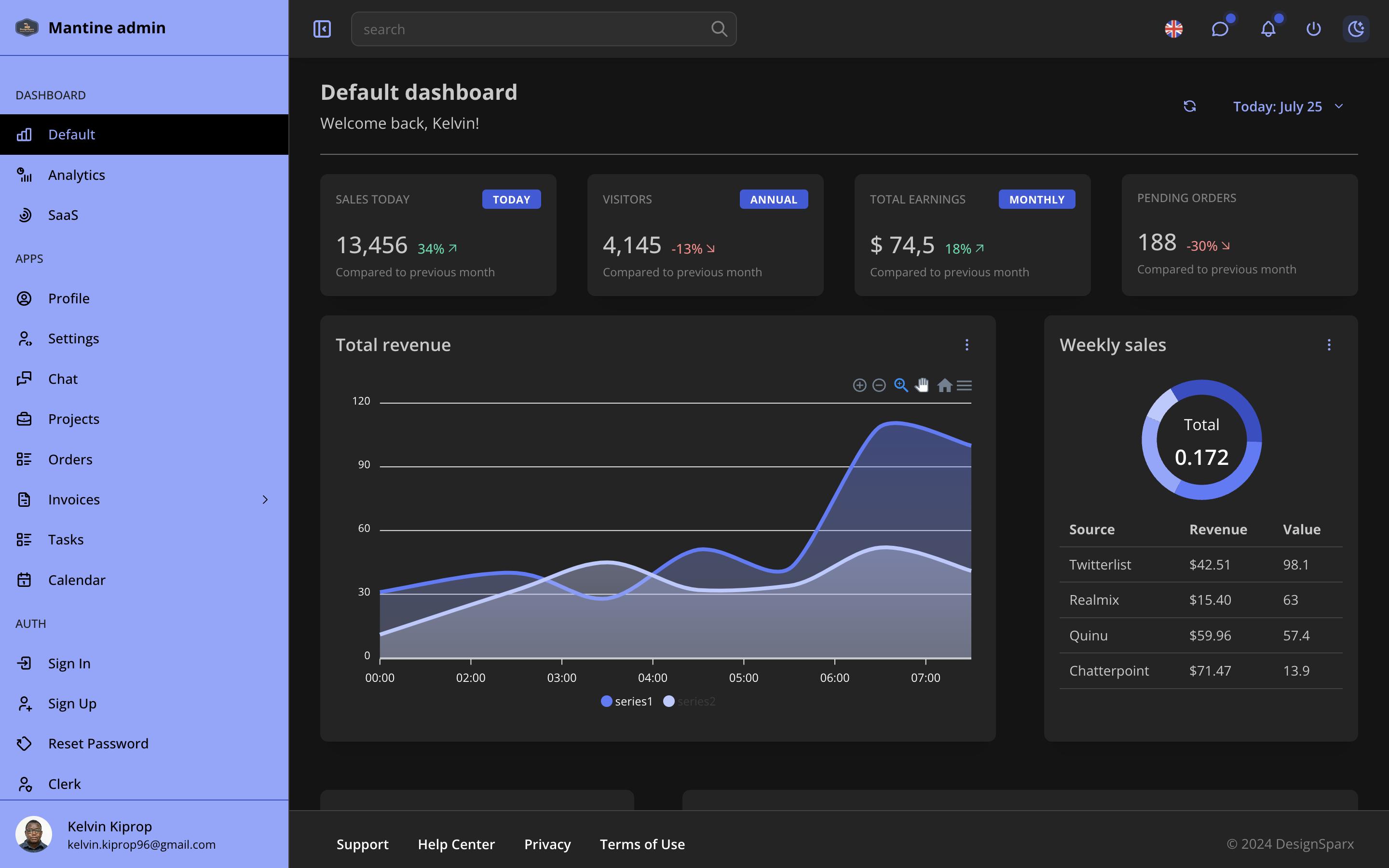
Overview
Mantine is a modern React component library that focuses on providing a wide array of components and hooks, designed with developer experience and flexibility in mind. It's built to create fully accessible web applications with speed and ease. Mantine stands out for its minimalistic design, high customizability, and a strong emphasis on performance and accessibility.
Key Features
-
Text Editor: Mantine provides a rich text editor component that you can use to create a text editor in your application. You can customize the toolbar, plugins, and other settings of the text editor.
-
Notifications: Mantine provides a notification system that you can use to display notifications in your application. You can customize the appearance, position, and behavior of the notifications.
-
Dark mode: Mantine supports dark mode out of the box. You can easily switch between light and dark mode by changing the theme settings.
-
Hooks: Mantine provides a set of hooks that you can use to build custom functionality in your application. These hooks include useLocalStorage, useClipboard, and useBoolean.
Benefits
-
Developer Experience: Mantine is designed to provide a great developer experience. It includes features like TypeScript support, auto-generated documentation, and a customizable theme system.
-
Performance: Mantine is built with performance in mind. It uses modern techniques like virtualization and memoization to ensure that your application runs smoothly.
-
Modularity: Mantine is modular, allowing you to import only the components and hooks that you need. This helps keep your bundle size small and your application fast.
-
Accessibility: Mantine is designed to be accessible, making sure that your components are usable for all users.
Some stats
- GitHub Stars: 26k
- Weekly Downloads: ~500k
- Open Source Contributors: ~600
Installation
You can install Mantine using npm:
pnpm add @mantine/core @mantine/hooks
After installing the required packages, you can wrap your application with the MantineProvider component to enable Mantine components:
import { createTheme, MantineProvider } from '@mantine/core';

const theme = createTheme({
  /** Put your mantine theme override here */
});

function Demo() {
  return (
    <MantineProvider theme={theme}>
      {/* Your app here */}
    </MantineProvider>
  );
}Example Usage
Here's an example of how you can use a button component from Mantine, showcasing the simplicity and power of this React UI library:
import { Button } from '@mantine/core';

function Demo() {
  return <Button variant="filled">Button</Button>;
}React Bootstrap
Overview
React Bootstrap is a popular library that provides Bootstrap components as React components. It allows you to use the power of Bootstrap's CSS framework in your React applications without the need for jQuery. React Bootstrap is a great choice if you are already familiar with Bootstrap and want to use its components in your React applications.
Key Features
-
Bootstrap Components: React Bootstrap provides a wide range of Bootstrap components as React components. You can use components like buttons, forms, modals, and more in your React applications.
-
No Dependencies: React Bootstrap does not have any dependencies on jQuery or Bootstrap's JavaScript. This makes it lightweight and easy to use in your React applications.
-
Responsive Grid System: React Bootstrap includes a responsive grid system that allows you to create layouts that adapt to different screen sizes and devices.
-
Theming: React Bootstrap allows you to customize the theme of your application using Bootstrap's built-in theming tools. You can change the colors, typography, and other design elements of your application.
Benefits
-
Easy to Use: If you are already familiar with Bootstrap, React Bootstrap will be easy to use. You can use the same components and classes that you are used to in your React applications.
-
No jQuery Dependency: React Bootstrap does not rely on jQuery or Bootstrap's JavaScript. This makes it lightweight and easy to use in your React applications.
-
Accessibility: React Bootstrap is designed to be accessible, making sure that your components are usable for all users.
-
Great for Prototyping: React Bootstrap is a great choice for prototyping or building simple applications quickly. You can use the power of Bootstrap's CSS framework in your React applications without the need for jQuery.
Some stats
- GitHub Stars: 22.3k
- Weekly Downloads: ~1.1M
- Open Source Contributors: ~500
Installation
You can install React Bootstrap using npm:
pnpm add react-bootstrap bootstrap
Example Usage
Here's an example of how you can use a button component from React Bootstrap in your React application:
import Button from 'react-bootstrap/Button';

function App() {
  return <Button variant="primary">Click me</Button>;
}Conclusion
Choosing the best React UI library for your project can be a challenging task. Each of the libraries we discussed in this article has its own strengths and weaknesses, and the best choice will depend on your project requirements and team expertise. Here's a quick summary of the libraries we discussed:
-
Material-UI: A comprehensive UI framework based on Google's Material Design principles. It provides a wide range of customizable components and theming capabilities.
-
Ant Design: A design system for enterprise-level products that offers high-quality React components with support for multiple languages and theme customization.
-
Chakra UI: A simple, modular, and accessible component library that provides responsive layouts, accessibility features, and a Figma UI kit.
-
Mantine: A modern React component library focused on developer experience, performance, and accessibility. It offers a rich text editor, notification system, and hooks.
-
React Bootstrap: A library that provides Bootstrap components as React components. It is easy to use, has no jQuery dependency, and is great for prototyping.
Each of these libraries has its own unique features and benefits, so take the time to explore them and choose the best React UI library that fits your project requirements. Happy coding! 🚀